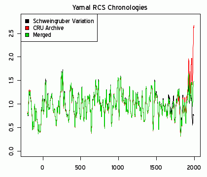
We now learn that the "scientists" intentionally selected tree ring data that would generate the famed hockey stick curve. Although it is customary to archive the raw data used in a published analysis so others can repeat the analysis like peer-reviewed experimentation is repeated, these "scientists" did not do so, and refused to provide their raw data to other researchers. A persevering scientist, Canadian mathematician Steve McIntyre has finally gotten the raw data from another source, and demonstrates how sharp warming was generated by ignoring part of the data as shown in the red curve below. Ignoring the opposite data results in the low-temperature black curve. The green curve is the combination of data that was traditionally used before the fraud.
To those who will ask, "But what about the Arctic ice melting?", I reply, if those claims are not also suspect, don't worry. The seasonal ice melt is also within historic norms. Don't expect the ocean to cool at the same rate as the atmosphere. The ocean has a much higher thermal mass, and so lags atmospheric temperature increases and decreases.
To those who will ask, "But what about the climate models?", I reply, large cell sizes and GIGO - Garbage In, Garbage Out. The fraud data, bogus surface temperature data and incorrect solar models are among the Garbage In.
As a lesson to all those wannabe Gores who want to profit from policy changes like carbon taxes, Steve McIntyre should get Al Gore's Nobel Prize, and the Nobel Prize Committee should make a public apology. As a lesson to all the wannabe change-society "scientists," Dr Michael Man, Professor Phil Jones, Professor Keith Briffa and everyone complicit in the fraud at the Hadley Centre Met Office in Exeter and the Climate Research Unit (CRU) at University of East Anglia should be fired, fined and black-balled from science, and all the lemmings who let their personal or political bias or grant greed cloud their scientific judgement should be listed on a web site for all potential employers to see.
Those concerned about petroleum use should direct their efforts at removing all military personnel from foreign soil so market prices are no longer distorted by force or its threat. When the price at the pump is no longer subsidized by the Department of Defense and the CIA, petroleum consumption will be discouraged, and the market will be motivated to provide alternatives without government coercion or subsidies. Taxpayers everywhere will thank you.
Ding dong the stick is dead
We’ve always suspected that Mann’s tree ring proxies aren’t all they are cracked up to be. The graph below is stunning in it’s message and I’m pleased to present it to WUWT readers. I’m sure the Team is already working up ways to say “it doesn’t matter”.
The quote of the week is:
I hardly know where to begin in terms of commentary on this difference.
- Steve McIntyre, Climate Audit in Yamal: A “Divergence” Problem
The graph above shows what happens to the “Hockey Stick” after additional tree ring data, recently released (after a long and protracted fight over data access) is added to the analysis of Hadley’s archived tree ring data in Yamal, Russia.
All of the sudden, it isn’t the “hottest period in 2000 years” anymore.
Steve writes:
The next graphic compares the RCS chronologies from the two slightly different data sets: red – the RCS chronology calculated from the CRU archive (with the 12 picked cores); black – the RCS chronology calculated using the Schweingruber Yamal sample of living trees instead of the 12 picked trees used in the CRU archive. The difference is breathtaking.

I’ll say. Ding Dong the stick is dead.
This comparison to CRU archive data illustrates the most extreme example of scientific cherry-picking ever seen. As Steve writes in comments at CA:
Also keep in mind the implausibly small size of the current portion of the Yamal archive. It would be one thing if they had only sampled 10 trees and this is what they got. But they selected 10 trees out of a larger population. Because the selection yields such different results from a nearby population sample, there is a compelling prima facie argument that they’ve made biased picks. This is rebuttable. I would welcome hearing the argument on the other side. I’ve notified one dendro of the issue and requested him to assist in the interpretation of the new data (but am not very hopeful that he will speak up.)
See the complete report on this new development in the sordid story of tree ring proxies used for climate interpretation at Climate Audit. And while you are there, please give Steve a hit on the tip jar. With this revelation, he’s earned it.
The next time somebody tells you that tree rings prove we are living in the “hottest period in 2000 years” show them this graph and point them to this Climate Audit article.
Here’s a “cliff’s notes” summary written by Steve’s partner in publication, Ross McKitrick:
Here’s a re-cap of this saga that should make clear the stunning importance of what Steve has found. One point of terminology: a tree ring record from a site is called a chronology, and is made up of tree ring records from individual trees at that site. Multiple tree ring series are combined using standard statistical algorithms that involve detrending and averaging (these methods are not at issue in this thread). A good chronology–good enough for research that is–should have at least 10 trees in it, and typically has much more.
1. In a 1995 Nature paper by Briffa, Schweingruber et al., they reported that 1032 was the coldest year of the millennium – right in the middle of the Medieval Warm Period. But the reconstruction depended on 3 short tree ring cores from the Polar Urals whose dating was very problematic. http://www.climateaudit.org/?p=877.
2. In the 1990s, Schweingruber obtained new Polar Urals data
with
more securely-dated cores for the MWP. Neither Briffa nor Schweingruber
published a new Polar Urals chronology using this data. An updated
chronology with this data would have yielded a very different picture,
namely a warm medieval era and no anomalous 20th century. Rather than
using the updated Polar Urals series, Briffa calculated a new
chronology from Yamal – one which had an enormous hockey stick shape.
After its publication, in virtually every study, Hockey Team members
dropped Polar Urals altogether and substituted Briffa’s Yamal series in
its place.
http://www.climateaudit.org/?p=528.
PS: The exception to this pattern was Esper et al (Science) 2002, which
used the combined Polar Urals data. But Esper refused to provide his
data. Steve got it in 2006 after extensive quasi-litigation with
Science (over 30 email requests and demands).
3. Subsequently, countless studies appeared from the Team
that
not
only used the Yamal data in place of the Polar Urals, but where Yamal
had a critical impact on the relative ranking of the 20th century
versus the medieval era.
http://www.climateaudit.org/?p=3099
4. Meanwhile Briffa repeatedly refused to release the Yamal measurement data used inhis calculation despite multiple uses of this series at journals that claimed to require data archiving. E.g. http://www.climateaudit.org/?p=542
5. Then one day Briffa et al. published a paper in 2008 using the Yamal series, again without archiving it. However they published in a Phil Tran Royal Soc journal which has strict data sharing rules. Steve got on the case. http://www.climateaudit.org/?p=3266
6. A short time ago, with the help of the journal editors, the data was pried loose and appeared at the CRU web site. http://www.climateaudit.org/?p=7142
7. It turns out that the late 20th century in the Yamal
series
has
only 10 tree ring chronologies after 1990 (5 after 1995), making it too
thin a sample to use (according to conventional rules). But the real
problem wasn’t that there were only 5-10 late 20th century cores- there
must have been a lot more. They were only using a subset of 10 cores as
of 1990, but there was no reason to use a small subset. (Had these been
randomly selected, this would be a thin sample, but perhaps passable.
But it appears that they weren’t randomly selected.)
http://www.climateaudit.org/?p=7142
8. Faced with a sample in the Taymir chronology that likely
had 3-4
times as many series as the Yamal chronology, Briffa added in data from
other researchers’ samples taken at the Avam site, some 400 km away. He
also used data from the Schweingruber sampling program circa 1990, also
taken about 400 km from Taymir. Regardless of the merits or otherwise
of pooling samples from such disparate locations, this establishes a
precedent where Briffa added a Schweingruber site to provide additional
samples. This, incidentally, ramped up the hockey-stickness of the (now
Avam-) Taymir chronology.
http://www.climateaudit.org/?p=7158
9. Steve thus looked for data from other samples at or near the Yamal site that could have been used to increase the sample size in the Briffa Yamal chronology. He quickly discovered a large set of 34 Schweingruber samples from living trees. Using these instead of the 12 trees in the Briffa (CRU) group that extend to the present yields Figure 2, showing a complete divergence in the 20th century. Thus the Schweingruber data completely contradicts the CRU series. Bear in mind the close collaboration of Schweingruber and Briffa all this time, and their habit of using one another’s data as needed.
10. Combining the CRU and Schweingruber data yields the green line in the 3rd figure above. While it doesn’t go down at the end, neither does it go up, and it yields a medieval era warmer than the present, on the standard interpretation. Thus the key ingredient in a lot of the studies that have been invoked to support the Hockey Stick, namely the Briffa Yamal series (red line above) depends on the influence of a thin subsample of post-1990 chronologies and the exclusion of the (much larger) collection of readily-available Schweingruber data for the same area.
MIRROR URL’s FOR MAIN GRAPHICS IN THE CLIMATE AUDIT POST:
If anyone has referenced the Yamal graphs at CA in blog posts, please use these URL’s so that they get loaded from WordPress high traffic server.
http://wattsupwiththat.files.wordpress.com/2009/09/count_comparison1.gif
http://wattsupwiththat.files.wordpress.com/2009/09/rcs_chronologies_rev2.gif
http://wattsupwiththat.files.wordpress.com/2009/09/rcs_merged_rev2.gif